Plugin: Word count
Let's get started by writing a very simple plugin and looking at some of the tools needed to develop one effectively. We'll start by writing a plugin that tells you how many words are in the current editor and display it in a small modal window.
Scaffolding Your Plugin
You can generate code scaffolding by running following ipm command:
$ ipm init wordcount
You can see that ipm has created about a dozen files that make up the plugin. Let's take a look at each of them to get an idea of how a plugin is structured, then we can modify them to get our word count functionality.
The basic plugin layout is as follows:
wordcount/
├── keymaps
│   └── wordcount.json
├── menus
│   └── wordcount.json
├── src
│   ├── WordcountMessageDialog.tsx
│   ├── env.ts
│   └── index.ts
├── styles
│   └── wordcount.css
├── package.json
├── tsconfig.json
└── tsdown.config.js
The plugin is written in TypeScript under src/. Running npm run build compiles it with tsdown into a lib/ directory of plain CommonJS — that build output is what Inkdrop actually loads, and what the main field points to. Not every plugin will have (or need) all of these directories. Let's see what some of these are so we can start messing with them.
package.json
Similar to Node modules, Inkdrop plugins contain a package.json file in their top-level directory. This file contains metadata about the plugin, such as the path to its "main" module, library dependencies, and manifests specifying the order in which its resources should be loaded.
In addition to some of the regular Node package.json keys available, Inkdrop package.json files have their own additions.
main: the path to the JavaScript file that's the entry point to your package. With the TypeScript scaffold this points at the compiled output (./lib/index), not yoursrc/source. If this is missing, Inkdrop will default to looking for anindex.js.styleSheets: an Array of Strings identifying the order of the style sheets your plugin needs to load. If not specified, style sheets in thestylesdirectory are added alphabetically.keymaps: an Array of Strings identifying the order of the key mappings your plugin needs to load. If not specified, mappings in thekeymapsdirectory are added alphabetically.menus: an Array of Strings identifying the order of the menu mappings your plugin needs to load. If not specified, mappings in themenusdirectory are added alphabetically.
The package.json in the plugin we've just generated looks like this currently:
{
  "name": "wordcount",
  "main": "./lib/index",
  "version": "0.0.0",
  "description": "A short description of your package",
  "keywords": [],
  "repository": "https://github.com/your-username/inkdrop-wordcount",
  "license": "MIT",
  "styleSheets": ["wordcount.css"],
  "engines": { "inkdrop": "^6.0.0" },
  "scripts": {
    "dev": "tsdown --watch",
    "build": "tsdown",
    "prepublishOnly": "npm run build"
  },
  "devDependencies": {
    "@inkdropapp/types": "^0.0.8",
    "@types/node": "^25.9.3",
    "@types/react": "^19.2.17",
    "tsdown": "^0.22.2",
    "typescript": "^6.0.3"
  }
}
One of the first things you should do is ensure that this information is filled out. The name, description, repository URL the project will be at, and the license can all be filled out immediately. The other information we'll get into more detail on as we go.
Do not forget to update the repository URL. The one generated for you is invalid by design and will prevent you from publishing your package until updated.
This plugin targets Inkdrop 6 ("inkdrop": "^6.0.0"). The scaffold is written
in TypeScript, compiled to plain CommonJS in lib/ by
tsdown, and typed against
@inkdropapp/types. If you're
upgrading an existing plugin from Inkdrop 5, follow the Plugin Migration
Guide from v5 to v6.
Source Code
If you want to extend Inkdrop's behavior, your plugin should contain a single top-level module, which you export from your entry file in src/. In the plugin we just generated, the entry is src/index.ts; tsdown compiles everything under src/ into CommonJS in lib/, and the main key points at that build output (./lib/index). The rest of your code lives alongside the entry file in src/ and is imported from it.
Your plugin's top-level module is a singleton object that manages the lifecycle of your extensions to Inkdrop. Even if your plugin creates ten different components and appends them to different parts of the DOM, it's all managed from your top-level object.
Your plugin's top-level module can implement the following basic methods. In Inkdrop 6, both receive the inkdrop Environment as their first argument:
activate(env): This optional method is called when your plugin is activated. Use this to do initialization work when your plugin is started (like setting up React Components or binding events).envis the same instance exposed globally asinkdrop— a future release will sandbox the global away, so prefer the argument.deactivate(env): This optional method is called when the window is shutting down. If your plugin is watching any files or holding external resources in any other way, release them here. If you're just subscribing to things on window, you don't need to worry because that's getting torn down anyway.
Style Sheets
Style sheets for your plugin should be placed in the styles directory. Any style sheets in this directory will be loaded and attached to the DOM when your plugin is activated. In Inkdrop 6, write them as plain CSS — the app has dropped LESS support, since modern CSS supports nested selectors and variables natively.
Ideally, you won't need much in the way of styling. Inkdrop's styles are based on Semantic UI which provides a standard set of components which define both the colors and UI elements for any plugin that fits into Inkdrop seamlessly.
If you do need special styling, try to keep only structural styles in the plugin style sheets. If you must specify colors and sizing, take them from Inkdrop's predefined CSS variables and design tokens. Every --color-* and --hsl-* token is published in the @inkdropapp/css repository. Use them like this:
.special-button.highlighted {
  background-color: var(--highlight-background);
}
An optional styleSheets array in your package.json can list the style sheets by name to specify a loading order; otherwise, style sheets are loaded alphabetically.
Keymaps
You can provide key bindings for commonly used actions for your extension, especially if you're also adding a new command. In our new plugin, we have a keymap filled in for us already in the keymaps/wordcount.json file:
{
  "body": {
    "ctrl-alt-o": "wordcount:toggle"
  }
}
This means that if you press Alt+Ctrl+O, our package will run the wordcount:toggle command. We'll look at that code next, but if you want to change the default key mapping, you can do that in this file.
Keymaps are placed in the keymaps subdirectory. By default, all keymaps are loaded in alphabetical order. An optional keymaps array in your package.json can specify which keymaps to load and in what order.
Keybindings are executed by determining which element the keypress occurred on. In the example above, the wordcount:toggle command is executed when pressing Alt+Ctrl+O on the body element. This means the key combination will work anywhere in the application.
See also: Keymap Manager
Menus
Menus are placed in the menus subdirectory. This defines menu elements like what pops up when you right click a context-menu or would go in the application menu to trigger functionality in your plugin.
By default, all menus are loaded in alphabetical order. An optional menus array in your package.json can specify which menus to load and in what order.
See also: Menu Manager
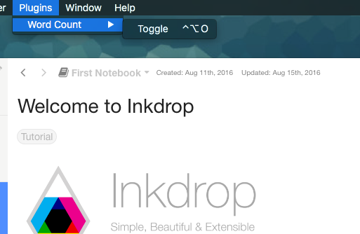
Application Menu
It's recommended that you create an application menu item under the Plugins menu for common actions with your plugin that aren't tied to a specific element. If we look in the menus/wordcount.json file that was generated for us, we'll see a section that looks like this:
{
  "menu": [
    {
      "label": "Plugins",
      "submenu": [
        {
          "label": "Word Count",
          "submenu": [
            {
              "label": "Toggle",
              "command": "wordcount:toggle"
            }
          ]
        }
      ]
    }
  ]
}
This section puts a "Toggle" menu item under a menu group named "Word Count" in the "Plugins" menu.
When you select that menu item, it will run the wordcount:toggle command, which we'll look at in a bit.
The menu templates you specify are merged with all other templates provided by other plugins in the order which they were loaded.
Context Menu
It's recommended to specify a context menu item for commands that are linked to specific parts of the interface. In our menus/wordcount.json file, we can see an auto-generated section that looks like this:
{
  "context-menu": {
    ".cm-editor": [
      {
        "label": "Toggle Word Count",
        "command": "wordcount:toggle"
      }
    ]
  }
}
This adds a "Toggle Word Count" menu option to the menu that pops up when you right-click in an Inkdrop text editor pane. The editor's root element is .cm-editor in Inkdrop 6 — it runs on CodeMirror 6, so the v5 .CodeMirror selector no longer matches.
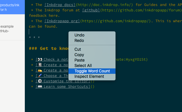
When you click that it will again run the wordcount:toggle method in your code.
Context menus are created by determining which element was selected and then adding all of the menu items whose selectors match that element (in the order which they were loaded). The process is then repeated for the elements until reaching the top of the DOM tree.
You can also add separators and submenus to your context menus. To add a submenu, provide a submenu key instead of a command. To add a separator, add an item with a single type: 'separator' key/value pair. For instance, you could do something like this:
{
  "context-menu": {
    "body": [
      {
        "label": 'Text'
        "submenu": [
          {"label": 'Copy Selected Text', "command": 'core:copy'}
          {"type": 'separator'}
          {"label": 'Selector All', "command": 'core:select-all'}
          {"type": 'separator'}
          {"label": 'Undo', "command": 'core:undo'}
        ]
      }
    ]
  }
}
Developing Your Plugin
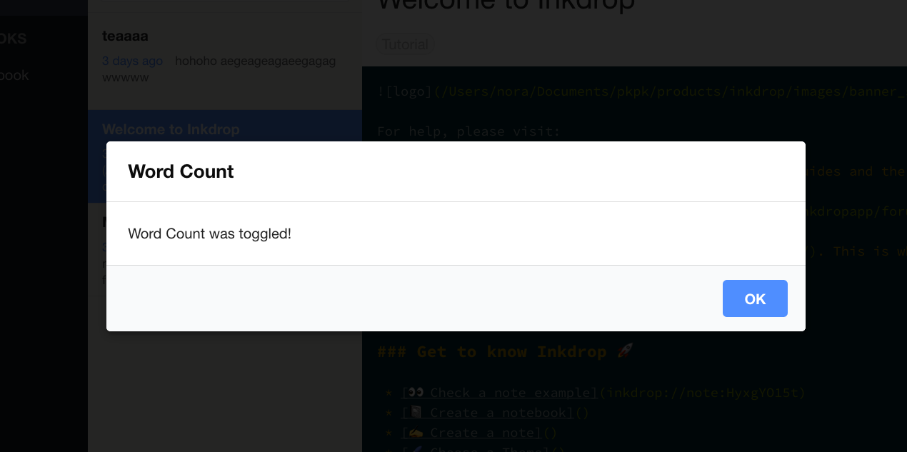
Currently with the generated package we have, if we run that wordcount:toggle command through the menu or the command palette, we'll get a dialog that says "Word Count was toggled!".
Building and Linking to the App Locally
Because the plugin is written in TypeScript, you first need to build it into the lib/ directory that main points to. Install the dependencies and start a watch build that rebuilds on every change:
npm install
npm run dev     # or `npm run build` for a one-off production build
Then symlink the plugin into Inkdrop for local development. Run ipm link --dev to symlink your repository to dev/packages in the user data directory.
Let Inkdrop run in Development Mode by selecting the menu Inkdrop > Preferences on macOS or File > Settings on Windows and Linux, clicking the General tab on the left hand navigation, and check the "Development Mode", then reload the app by pressing Alt+Cmd+Shift+R / Alt+Ctrl+R.
Understanding the Generated Code
Let's take a look at the code in our src directory and see what is happening. There are three files:
src/index.ts— the main module, pointed to (after compilation tolib/) by themainfield inpackage.json. It manages the plugin lifecycle.src/WordcountMessageDialog.tsx— a React component that renders the plugin's modal dialog.src/env.ts— a small helper that captures theinkdropenvironment passed toactivate()so the rest of the plugin can reach it.
The environment helper (src/env.ts)
In Inkdrop 6, activate() receives the inkdrop Environment as its first argument, and a future release will sandbox the global inkdrop reference away. So instead of reaching for the global, the scaffold captures the environment once and shares it through a small module:
import type { Environment } from '@inkdropapp/types'

let captured: Environment | undefined

export function setEnv(env: Environment | undefined): void {
  captured = env
}

export function getEnv(): Environment {
  if (!captured) {
    throw new Error('[wordcount] env accessed before activate()')
  }
  return captured
}
activate() calls setEnv(env), and any other module can then call getEnv() to use the environment. See activate() receives the inkdrop environment for the rationale.
The dialog component (src/WordcountMessageDialog.tsx)
Inkdrop is built with React, and you make UI components with it. WordcountMessageDialog is a function component that renders the modal message dialog shown when the command is toggled:
import React, { useEffect, useCallback } from 'react'
import { logger, useModal } from 'inkdrop'
import type { Dialog as DialogClass } from '@inkdropapp/types'
import { getEnv } from './env'

export const WordcountMessageDialog: React.FC = () => {
  const modal = useModal()
  const Dialog = inkdrop.components.getComponentClass('Dialog') as DialogClass

  const toggle = useCallback(() => {
    modal.show()
    logger.debug('Wordcount was toggled!')
  }, [modal])

  useEffect(() => {
    const sub = getEnv().commands.add(document.body, {
      'wordcount:toggle': toggle
    })
    return () => sub.dispose()
  }, [toggle])

  return (
    <Dialog {...modal.state} onBackdropClick={modal.close}>
      <Dialog.Title>Wordcount</Dialog.Title>
      <Dialog.Content>Wordcount was toggled!</Dialog.Content>
      <Dialog.Actions>
        <button className="ui button" onClick={modal.close}>
          Close
        </button>
      </Dialog.Actions>
    </Dialog>
  )
}
It grabs the built-in Dialog component from the component manager:
const Dialog = inkdrop.components.getComponentClass('Dialog') as DialogClass
getComponentClass replaces v5's inkdrop.components.classes.Dialog. The as DialogClass cast restores the Dialog.Title / Dialog.Content / Dialog.Actions sub-component types from @inkdropapp/types.
It uses the useModal built-in React Hook to manage the dialog's visibility state. You can show the dialog by calling modal.show() and hide it with modal.close(). To toggle the dialog from a command, it defines a callback function with React's useCallback:
const toggle = useCallback(() => {
  modal.show()
  logger.debug('Wordcount was toggled!')
}, [modal])
Then, it binds the callback to the "wordcount:toggle" command with React's useEffect, reaching the command registry through getEnv():
useEffect(() => {
  const sub = getEnv().commands.add(document.body, {
    'wordcount:toggle': toggle
  })
  return () => sub.dispose()
}, [toggle])
The commands.add method returns an instance of the CompositeDisposable class. Returning its dispose from the effect automatically unbinds the command when the component is unmounted from the DOM.
The main module (src/index.ts)
The entry point wires everything together. It's a class that implements IInkdropPlugin, registering the dialog on activate() and cleaning up on deactivate():
import type { Environment, IInkdropPlugin } from '@inkdropapp/types'
import { setEnv } from './env'
import { WordcountMessageDialog } from './WordcountMessageDialog'

class InkdropPlugin implements IInkdropPlugin {
  activate(env: Environment) {
    setEnv(env)
    env.components.registerClass(WordcountMessageDialog)
    env.layouts.addComponentToLayout('modals', 'WordcountMessageDialog')
  }

  deactivate(env: Environment) {
    env.layouts.removeComponentFromLayout('modals', 'WordcountMessageDialog')
    env.components.deleteClass(WordcountMessageDialog)
    setEnv(undefined)
  }
}

export default new InkdropPlugin()
On activation it stores the environment with setEnv(env), registers the WordcountMessageDialog class with the component registry, and adds it to a hidden modals layout. On deactivation it tears all of that down and clears the captured environment.
See also: Component Manager and Layout Manager
The Flow
So, let's review the actual flow in this plugin.
- Inkdrop starts up
- Inkdrop starts loading plugins
- Inkdrop reads your
package.json - Inkdrop loads keymaps, menus, styles and the main module
- Inkdrop finishes loading plugins
- Inkdrop executes the
activatemethod in your main module which sets up the UI by creating the hidden modal message dialog - Inkdrop executes the plugin command
wordcount:togglewhich reveals the hidden modal message dialog - At some point, the user executes the
wordcount:togglecommand again - Inkdrop executes the command which hides the modal message dialog
Counting the Words
So now that we understand what is happening, let's modify the code so that our little modal message dialog shows us the current word count instead of static text.
We'll do this in a very simple way. When the dialog is toggled, we'll count the words right before displaying the modal. So let's do this in the toggle command.
If we add some code to count the words and ask the React component to update itself, we'll have something as following in src/WordcountMessageDialog.tsx.
First, import useState method from react:
import React, { useState, useEffect, useCallback } from 'react'
Next, import react-redux. You don't have to add it as a dependency because Inkdrop provides it out of the box:
import { useSelector } from 'react-redux'
Then, in the dialog component, add the following line to remember the word count using React's useState:
const [count, setCount] = useState(0)
The app state is managed with Redux. You can refer the state via inkdrop.store or the Redux function. In this example, we use useSelector function to get the current state of the editing note like so:
const noteBody = useSelector(selectEditingNoteBody)
The selectEditingNoteBody function should be defined outside the component function like so. Typing the state shape inline keeps the selector strict-mode clean:
const selectEditingNoteBody = (state: { editingNote?: { body: string } }) =>
  state.editingNote ? state.editingNote.body : ''
Now, let's define a function that counts the words:
const countWords = useCallback(() => {
  return noteBody.split(/\s+/).length
}, [noteBody])
We call it when toggling the dialog:
const toggle = useCallback(() => {
  setCount(countWords())
  modal.show()
}, [countWords, modal])
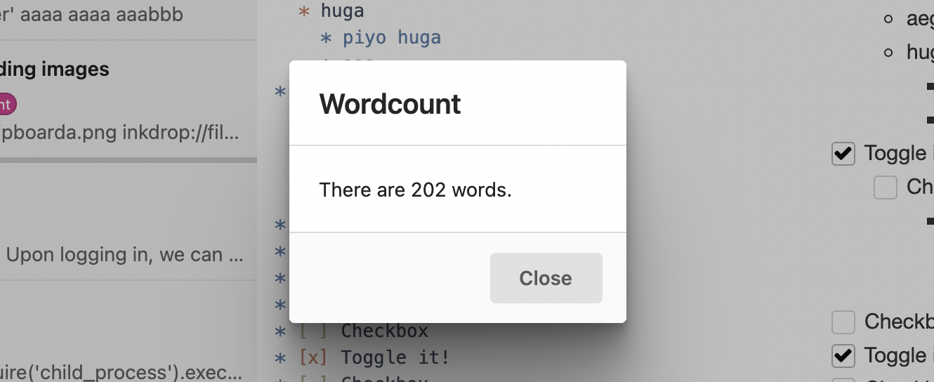
Finally, we tell our message dialog to display the word count.
return (
  <Dialog {...modal.state} onBackdropClick={modal.close}>
    <Dialog.Title>Wordcount</Dialog.Title>
    <Dialog.Content>There are {count} words.</Dialog.Content>
    <Dialog.Actions>
      <button className="ui button" onClick={modal.close}>
        Close
      </button>
    </Dialog.Actions>
  </Dialog>
)
Now, src/WordcountMessageDialog.tsx looks like this:
import React, { useState, useEffect, useCallback } from 'react'
import { logger, useModal } from 'inkdrop'
import { useSelector } from 'react-redux'
import type { Dialog as DialogClass } from '@inkdropapp/types'
import { getEnv } from './env'

const selectEditingNoteBody = (state: { editingNote?: { body: string } }) =>
  state.editingNote ? state.editingNote.body : ''

export const WordcountMessageDialog: React.FC = () => {
  const modal = useModal()
  const Dialog = inkdrop.components.getComponentClass('Dialog') as DialogClass
  const [count, setCount] = useState(0)
  const noteBody = useSelector(selectEditingNoteBody)

  const countWords = useCallback(() => {
    return noteBody.split(/\s+/).length
  }, [noteBody])

  const toggle = useCallback(() => {
    setCount(countWords())
    modal.show()
  }, [countWords, modal])

  useEffect(() => {
    const sub = getEnv().commands.add(document.body, {
      'wordcount:toggle': toggle
    })
    return () => sub.dispose()
  }, [toggle])

  return (
    <Dialog {...modal.state} onBackdropClick={modal.close}>
      <Dialog.Title>Wordcount</Dialog.Title>
      <Dialog.Content>There are {count} words.</Dialog.Content>
      <Dialog.Actions>
        <button className="ui button" onClick={modal.close}>
          Close
        </button>
      </Dialog.Actions>
    </Dialog>
  )
}
Pretty simple! We take the count number that was passed in and place it into a string that we then stick into the element that our component is controlling.
Basic Debugging
You'll notice a logger.debug call in the code, which writes to the developer console. One of the cool things about Inkdrop being built on Chromium is that you can use some of the same debugging tools available to you that you have when doing web development.
To open up the Developer Console, press Alt+Cmd+I on macOS or Alt+Ctrl+I on Linux and Windows, or choose the menu option Developer > Toggle Developer Tools.
From here you can inspect objects, run code and view console output just as though you were debugging a web site.
Publishing
Now that our simple plugin is working and tested, let's go ahead and publish it so it's available to the world.
Inkdrop plugins are published with the ipm (Inkdrop Plugin Manager) CLI — the same tool we used to scaffold and link the plugin. In Inkdrop 6 it's a standalone package; if you haven't installed and authenticated it yet, do so once:
npm install -g @inkdropapp/ipm-cli
ipm configure
Besides searching for and installing plugins, ipm publishes them to the public registry and updates them.
Prepare Your Package
There are a few things you should double check before publishing:
- Your
package.jsonfile hasname,description, andrepositoryfields. - Your
package.jsonfile has aversionfield with a value of "0.0.0". - Your
package.jsonfile has anenginesfield that contains an entry for Inkdrop. For an Inkdrop 6 plugin or theme, it should be:"engines": {"inkdrop": "^6.0.0"}. - Your plugin has a
README.mdfile at the root. - Change the repository url in the
package.jsonfile to match the URL of your repository. - Your plugin is in a Git repository that has been pushed to GitHub. Follow this guide if your plugin isn't already on GitHub.
Publish Your Package
Before you publish a plugin it is a good idea to check ahead of time if a plugin with the same name has already been published to the Inkdrop package registry. You can do that by visiting https://my.inkdrop.app/plugins/wordcount to see if the plugin already exists. If it does, update your plugin's name to something that is available before proceeding.
The recommended flow is to bump the version with npm version, then publish with ipm publish:
cd path/to/wordcount

# Bump package.json, commit, and create a matching git tag
npm version minor

# Build (via the prepublishOnly script) and publish to the registry
ipm publish
npm version <type> updates the version field in package.json, commits the change, and creates a v<version> Git tag. ipm publish then runs your prepublishOnly script (which builds the plugin into lib/), registers the plugin on my.inkdrop.app the first time you publish, and publishes the new version. Push the commit and tag to GitHub so the release is available to everyone:
git push --follow-tags
Your package is now published and available on my.inkdrop.app. Head on over to https://my.inkdrop.app/plugins/wordcount to see your plugin's page.
<type> can be major, minor, or patch:
majorincrements the first number (1.0.0) — use it for changes that break backwards compatibility, like changing defaults or removing features.minorincrements the second number (0.1.0) — use it when adding new functionality or making improvements on existing code.patchincrements the third number (0.0.1) — use it when you fix a bug that was causing incorrect behaviour.
Check out semantic versioning to learn more about best practices for versioning your plugin releases. You can pass --dry-run to ipm publish to simulate the process without publishing, run ipm help publish to see all the available options, and ipm help to see all the other available commands.
Summary
We've now generated, customized and published our first plugin for Inkdrop. Congratulations! Now anyone can install our masterpiece from directly within Inkdrop as we did in Extend Inkdrop with Plugins.
If you can't decide what to build, there are many ideas posted on our forum and those topics are tagged with plugin-idea.
You will get inspirations from them!